Today’s children’s book illustrations are wide and varied in their styles, ranging from detailed black and white pencil drawings to bold and colourful digitally manipulated images. In this statement, I will look at where my own work could be placed within the context of modern children’s book illustrations. While many illustrators have chosen to use a brightly coloured and light-hearted style to appeal to a young audience, others such as Australian author/illustrator Shaun Tan prefer a more mysterious and solemn feel to their work. By comparing my work to Tan’s work, I will introduce some of my personal tastes in regards to illustration styles and examine my current work in relation to modern children’s book illustrations.
Working from IntuitionIn his essay ‘Picture Books: Who Are They For?’, Shaun Tan writes that “writing and painting is very much about trying different things based on hunches and intuition, often in a silly and playful way, and then looking at them critically to see if they make any kind of sense when cast against the backdrop of lived experience… Being an artist is not about manipulating objects or an audience so much as constantly assessing a series of often accidental and mysterious ideas.”
1This experimental approach, fine-tuned with a critical eye, is how I have begun my year. My aim is to develop a style of illustration that not only appeals to children, but also satisfies my own desires and tastes as an artist, with illustrations that are rich in emotion and which are able to deal with real issues. After allowing my pencil to fly in an exhilarating hit-and-miss fashion, I then sit back and examine my work to see whether it holds true to my aims. Although many pieces do not measure up to my standard of success, some do, and I have found that this process of working from intuition has been very helpful in loosening me up as an artist.

Esther Griffiths, Waiting, 2009.
Tastes Dictate StyleWhilst scribbling and scrutinizing my scribbles, I have also been looking at various other artists and illustrators. I have found that I am drawn to styles that are full of strong emotion and capture “real life”, with an edge of darkness, but also a ray of bright hope glimmering. I believe it is important to expose children to the realities of life, but from a hopeful and optimistic platform.
Through my explorations, I have discovered that I tend to work with an element of darkness, scratchiness, and unevenness. I am drawn to the emotive feelings this encourages, especially where the artist’s physical movements are shown. Intaglio printing brings out many of these qualities. Scratchiness, and a certain amount of unpredictability, is an integral part of the intaglio process. I am particularly fond of how the plate tone gives such a lovely smudgy darkness to the image, but without overpowering it.
Shaun TanShaun Tan is one artist with whom I identify. The emotional depth and smudgy, grungy darkness of his work gives a quality I enjoy exploring in my own work. Tan is the illustrator of several picture books, including The Arrival and The Red Tree, both of which have a sense of dark, humble beauty to them, are full of rich emotion, and have several layers of meaning which could be read into them. Brushstrokes, pencil lines, and uneven edges grace his pages with finesse, and give a rough and textured look to his illustrations. Dark monotonous colours provide his images with a feeling of timelessness and a somewhat brooding sense.
 Shaun Tan, from The Arrival, 2006.
I particularly enjoy the temporal duration of Tan’s work. His stories develop clarity as they progress, and layers of meaning are revealed with repeated readings. The effect of this is that the reader is drawn back to the book over and over again. An example is
The Red Tree, which disappointed me at first because I felt that I could not make sense of the story. It was only after poring over the pages several times that I came to appreciate that this apparent lack of sense is an integral part of the feeling of confusion and disjointedness that Tan is trying to portray in the book, and The Red Tree is now one of my favourite illustrated books.
 Shaun Tan, from The Red Tree, 2001.
Tan says that he enjoys leaving readers with questions that they themselves must find an answer to. “Words and images play off each other, producing a single question for the reader each time, ‘What do you make of this?’ And this in turn generates further question, ones we will ultimately apply to a more familiar reality.”
2 Much of his work contain gripping metaphors – realism portrayed through fantasy – such as giants incinerating people in
The Arrival, or a big fish hovering above a young girl in
The Red Tree. We can get a clear sense of the emotions and feelings being communicated, but the precise “meaning” of the metaphors is left open, to prompt some level of interpretation and imagination.
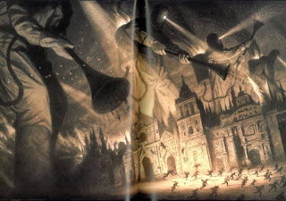 Shaun Tan, from The Arrival, 2006.
The
Red Tree evoked in me a similar emotional response as when I recently read the classic story of
The Little Match Girl, written by Hans Christian Anderson in 1846. In both stories it is the glimpse of hope provided in an otherwise sombre atmosphere that particularly fascinates me.
In my own image of
The Little Match Girl – where she is looking up at her grandmother who is soon to carry her away from this life – I was seeking to embody that combined feeling of darkness and hope. A mixed look of unbelief, surprise, weariness, and anticipation is written on her face. She looks up, a strange glow lighting up her face with a ray of hope. The close up shot – showing only her face – gives this piece an intimate and personal feel, placing the focus not on what she is looking at, but on how she feels. The background is dark and brooding – speaking of the harsh would that she is living in and foreshadowing her death. Texture and line play a large part in this drawing, and give it a loose, expressive feel… a sense of tumultuous thoughts and emotions.
 Esther Griffiths, from The Little Match Girl series, 2009.
In
The Red Tree, Tan uses similar techniques to convey a sense of hopelessness and despair. One image that particularly appeals to me shows a young girl standing on a dimly lit stage with a puppet on her hand, before a faceless audience. Bizarre creatures and contraptions surround her, leering at her with disdainful expectancy. Her head droops, and a small tear glimmers on her cheek. The way that her feelings of confusion, incompetence, and pressure are conveyed is very effective in this image through the use of these metaphors.
 Shaun Tan, from The Red Tree, 2001.
Throughout the book, the girl’s eyes are far apart and droop downward, giving her face a look of weariness and sadness. Her eyes are partially covered by her hair in many of the book’s images, suggesting timidity. Her dress is plain, showing that she prefers not to draw attention to herself. She is often overwhelmed by a vast expanse of landscape, portraying a sense of aloneness. Her mouth is never shown apart from the final image. She is enshrouded with silence… an internal sadness that she keeps bottled inside.
The use of these methods to convey a mood of depression and anxiety is very effective. Children and adults alike can identify and empathise with the young girl in
The Red Tree as they compare her experiences with their own, linking imagination to reality. It is this endearing emotional connection that I endeavour to achieve in my own work.
Similar but DifferentWhile some of my work may have a similar emotive feeling to Tan’s, our techniques differ. Where Tan provides strange and fantastical buildings, landscapes or beings to heighten the feeling of confusion or alienation, I prefer to use simple texture and line. And often where he seeks to ask readers questions, I seek to answer them.
The way that Shaun Tan evokes such strong emotions through such images really motivates me. However, I feel that some of his work can verge on the vague side. The danger with this is that the reader can feel lost if there are too few clues as to intention or direction. It is the beauty of his images that rescues Tan from his apparent elusiveness, and it is this depth and beauty that I seek to develop in my own work.
In ConclusionBy comparing my work to Shaun Tan’s, I have not only gained a greater appreciation for the murky beauty and emotional influence that his work has, but I have also clarified my own ideas on where my illustration style is headed. The layered readings, dusky simplicity, and emotional depth to his images are things that I wish to pursue in my own work, thus producing images that not only gratify my own aspirations as an artist but also connect with and delight readers of all varieties!
 Shaun Tan, from The Red Tree, 2001.